“Vinyl is like the poor man’s art collection”
“The first contact you have with the music is the record cover” — collector and originator” Antoine de Beaupré.
The importance of art in music
I have long been fascinated by albums and their cover art, which holds a particular resonance for me. I have lived through the different eras when vinyl was all the music listener knew, through the release of cassette tapes, the Walkman, the rise of CD’s, then MP3s, iPods, Napster and into the rise of streaming services and hopefully vinyl again.
For me the album art was always an integral part of the tactile listening experience and somewhere along the way in those various format moves we seem to have lost the significance of the sleeve design art. Album covers were aesthetic objects that would become iconic images that then were emulated and reproduced in many forms on Tee shirts, DIY badges, patches, emblazoned on school bags that were displayed as a badge of honour.
I still remember vividly the simple pleasure of browsing record covers in my older brothers’ record collections and from an early age I became hooked on the ambience of delving into the artwork, lyrics while absorbing the music. That was apart from the first time I picked up the Black Sabbath Greatest hits record with the chaotic cover featuring the “El Triunfo de la Muerte” painting by Pieter Bruegel the Elder which gave me the “heebie-jeebies”, but more pleasurable memories include the first time seeing Led Zeppelin’s Physical Graffiti and especially the Thin Lizzy Jailbreak album gate-fold cover, designed by Jim Fitzpatrick which was influenced by H.G.Wells ‘War of the Worlds’ and American Marvel comics.
Every piece of background notes, credits, lyrics were scrutinised and probably over-analysed in the search for clues to the meaning, as the vinyl record played on the turntable. Some covers led to searching out an artist’s other work and indeed other areas of culture including paintings, which also led to a lifetime long curiosity habit. I remember reading an interview with designer Peter Saville, where he mentioned
“the extent to which postwar pop culture has been the great educator is undervalued”.
French filmmaker Michael Gondry directed this advert for Pandora in 2018, with a trip through album artwork history, how many do you recognise instantly?
In the current digital music streaming dominant era, squinting at a thumbnail-sized representation of a sleeve image on a finger-print smudged smartphone screen just doesn’t provide the same experience for the music listener.
Hipgnosis
I just recently watched the 2022 Hipgnosis documentary, ‘Squaring the Circle’ directed by Antoin Corbijn which has many talking heads contributions including Robert Plant, Peter Gabriel, Dave Gilmour, Roger Waters and Noel Gallagher who mentions the importance of the album cover art to him.
“What I love about vinyl records is the artwork, great design, great photography and imagination”
This entertaining documentary charts the rise and ultimately poignant fall of one of the most famous design agencies over their fifteen year career, Hipgnosis were responsible for so many of the now most iconic covers in music history creating 372 covers from their first for Pink Floyd’s 1968 album ‘A Saucerful of Secrets’ to Led Zeppelin’s ‘Coda’.
When you look at the incredible list, it comprises of bands such as AC/DC, Black Sabbath, Peter Gabriel, The Police, Genesis, Led Zeppelin, Pink Floyd, Paul McCartney, Robert Plant, T. Rex, Wings, 10cc, Yes and XTC and many more. You can view many of their works in this Hipgnosis Album Cover online gallery. The depth and range of style, moods and textures in these album covers makes it an arduous task, to try pick favourites from it. On the creative work of Hipgnosis, Gallagher goes on to say:
“They represented the golden age of the music business where people believed that music was art and could change the world, where as now music is a commodity and it changes the share price of whatever company it is attached to. In the 60s rock stars were artists, graphic designers were artists. All that work has stood the test of time”
(There is also another Storm Thorgerson by Director Roddy Bogawa called Taken By Storm: The Art Of Storm Thorgerson and Hipgnosis)
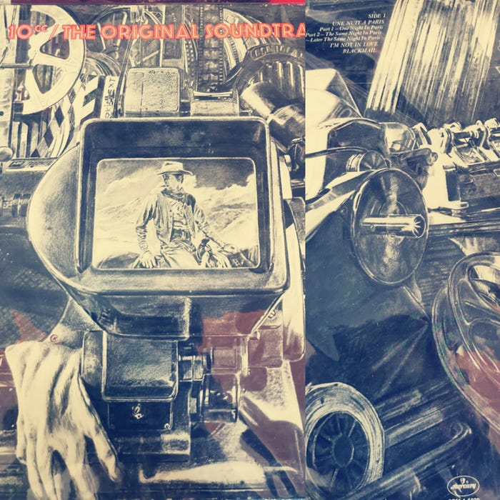
After much deliberation, even though I didn’t particularly like the band or the record, the cover of the 10cc The Original Soundtrack by Hipgnosis artist Humphrey Ocean is simply gorgeous and has to be one of my favourites.
Album cover design history
Originally in the first half of the 20th century there was no relation between the cover and the music, records just came in a brown paper bag and were being sold in the back of appliance stores. Record albums were first released in a type of bounded photographic album, similar to what we now take for a wedding album with no attention paid to the artist or music. This is why we still refer to LP’s as record albums.
In 1939 when a young Alex Steinweiss was hired by Columbia records as their new art director and he totally disrupted everything and revolutionized the record industry with a suggestion for how to illustrate the packaging of 78 rpm records, incorporating poster type art. It didn’t take long for Columbia executives to go all in on the young man’s idea once sales increased by more than 800% for their first release!
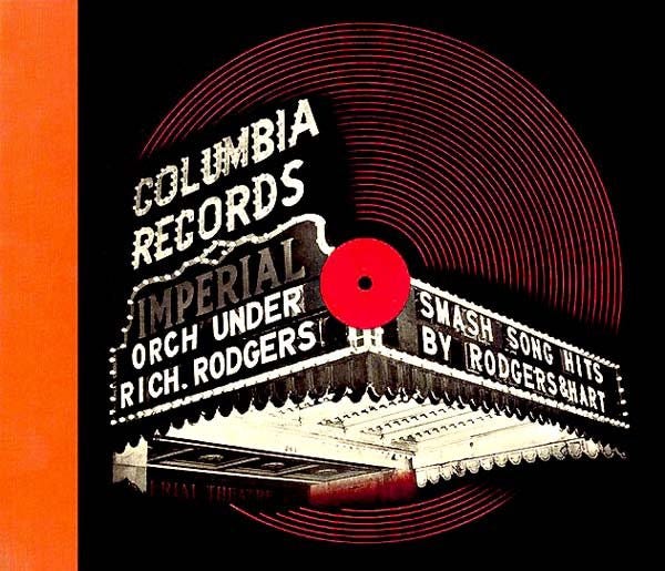
"I love music so much and I had such ambition that I was willing to go way beyond what the hell they paid me for. I wanted people to look at the artwork and hear the music." —Alex Steinweiss
Steinweiss designed over 2500 record covers in the period 1938 to 1972, had his own typography and every cover he created has his name in the corner.
Nothing You Can See That Isn’t Shown
From the early illustrative album design era of the 1940’s to integrating more colourful paintings, to photograph and more illustrative eras in the 50s, where Jazz and the Blue note label especially defined the look of album design, with creative people like Reid Miles who designed 500 stunning record covers for the label!
The Beatles started the 60’s decade with their ‘Please Please Me’ album with the band members photograph on the sleeve captured by Angus McBean at EMI’s headquarters on London’s Manchester Square, moving through different playful looks on albums, ‘With The Beatles’, ‘A Hard Day’s Night’, ‘Beatles For Sale’, ‘Help!’ to more serious poses on Rubber Soul to the black and white artwork/part line drawing and part collage for ‘Revolver’ created by artist Klaus Voormann, to progressing to their 1967 revolutionary concept album in Sgt Peppers.
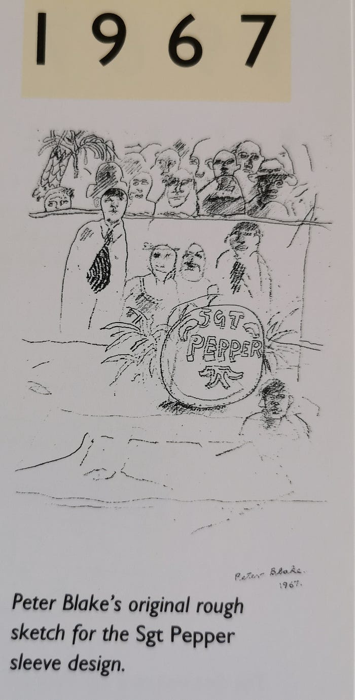
Designed by Peter Blake, who considered it “a piece of art rather than an album cover. It was almost a piece of theater design.” (Blake continued to create terrific output throughout his career including the charity single sleeve for Do They Know It’s Christmas? and Paul Weller’s classic album ‘Stanley Road’, as well as the Oasis compilation ‘Stop the Clocks’ which must have provided Beatles fans the Gallagher brothers with much glee.)
It was the first album to have lyrics displayed on the back and it totally changed the landscape of album cover art.
“We wanted the whole of Pepper to be so that you could look at the front cover for years, and study all those people and read all the words on the back” — Paul McCartney
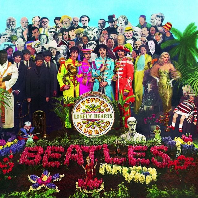
When reading a little bit more on the album sleeve design from The Beatles Anthology, something I hadn’t really thought about was the concern over copyright at the time from the record label and the then chairman of EMI Joseph Lockwood, who Paul had assured “don’t worry Joe, its going to be great, man” after Lockwood was trying to explain the legal dept was going mad at the possibility of dozens of lawsuits.
But Paul McCartney was at the heights of his creative powers and was steadfast about including everyone’s image and suggested that the record company should contact each person for permission. The label relented, sending a letter saying basically to sign here if you agree, and most did except for Leo Gorcey from the Bowery Boys who was the only one to request payment with a fee of $500. He was subsequently removed, losing a place in popular culture history.
One of the other most powerful images to this day remains to be the cover of ‘London Calling’ album from The Clash, designed by graphic designer Ray Lowry as it captures the energy of the youthful rebellion of the time while also paying homage to Elvis Presley’s 1956 RCA debut LP with a similar colour and typography.


Clash bassist Paul Simonon recalled destroying his beloved Fender Precision Bass in a moment of frustration at the bouncers in the Palladium in 1979 in New York who wouldn’t let audience members stand up at their concert. That moment that was captured by photographer Pennie Smith, who was since quoted as having no interest in music, and has been happy traveling a different life in art and said “They make the noise, I do the pictures”
My Life in 12 Sleeves
I went along to check out a talk My Life in 12 Sleeves with graphic designer Stephen Averill, who was responsible for the creation of so many iconic Irish album covers. This discussion explored his combined love of graphic design and music through his 12 chosen record sleeves and provided some interesting anecdotes, tales from the music industry and background to so many popular Irish album covers.

It was the ‘With The Beatles’ album, with the Robert Freeman photo that inspired him to enter into the art design world. He described his career trajectory, moving from a printing firm which he recalls as disastrous and having nothing to do with design to getting an opportunity to work in Arks Advertising.
“For the most part sleeve printing was a commercial entity and not considered fine art”
He thoughtfully explained the craftsmanship in the early analog design period, the step by step piecemeal process where he had started with pieces of artwork, cardboard, tracing paper on a bench to the finished work. After the introduction of computers, Averril also mentioned the changes involved moving from analog, having to rethink the creative process which became easier in one sense however there was since little chance of bands looking at the step by step process any longer.
Interestingly, he said the change over in design from vinyl to cd, wasn’t an emotive experience as one would imagine because for the designer it presented more work opportunities, with the ability to add extensive booklets and provided a different challenge.
He always explained his longtime relationship as U2’s art director. The musician and designer mentioned suggesting they move away from the earlier band name of The Hype to U2, helping shape their visual identity across different album covers and there was a collective chuckle from the audience when he mentioned Bono still doesn’t like the name.
Averill was co-founder of the Radiators from Space and created the his own lettering for the band logo, which reminded me of the quote from The Art of Design Netflix documentary, which featured acclaimed graphic designer Paula Scher (who while art director for CBS and Atlantic Records was responsible of covers for including Boston, The Rolling Stones, Cheap Trick and Blue Oyster Cult.)
“Typography is painting with words”

Amongst the 12 sleeves he selected, Averill went through the varied experiences working with Irish bands Whipping Boy, An Emotional Fish, Mary Coughlan, Cactus World News, Virgin Prunes and Something Happens, and always wanting to try create the best work for the band.
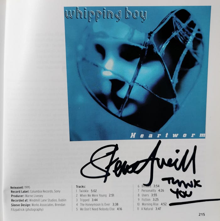
Afterwards, I thanked him for an enjoyable retracing of his wonderful design career and I had brought along the book 101 Irish Records (You Must Hear Before You Die) by Tony Clayton-Lea and asked him to sign any one of the many selections inside that he was responsible for designing. He duly obliged, after we settled on the Whipping Boy ‘Heartworm’ entry.
Album Cover Album
Roger Dean designed over sixty album covers for bands such as Yes, Uriah Heep and Asia. In his 1984 book, the third edition of “Album Cover Album” he says:
“Music is an abstract thing, it exists only while you listen to it. But to keep listening to it, you have to have it as a material thing :a record. Ultimately, only the packaging makes it tangible and real”.
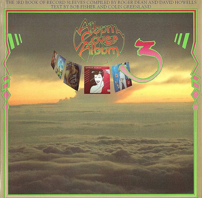
In that same book, which features some glorious sleeve art images, the prolific rock photographer Brian Griffin whose work includes the shot for Depeche Mode’s album ‘A Broken Frame’ and who was noted to have been always committed to the album cover as a crucial vehicle for artistic expression:
“It is the vehicle, because it gets into the living room, as opposed to some art sanctum. It’s on the street, it’s in the shops, it’s in the home and it stays around for a very long time” — Brian Griffin
I’m going back through my own growing record collection, some of which is indeed around a long time and contains many sleeves thoughtfully designed and crafted by some even mentioned in this post.
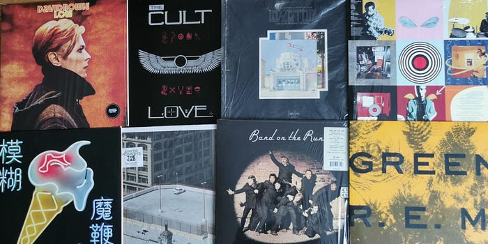
During the 90s against my better judgement I stopped purchasing vinyl records when it became too cumbersome to find new releases and I resigned myself to CD’s, which I have always loathed. But I returned to collecting vinyl again with the re-emergence and more releases being generally available.
Tastes, fashion and music appear to repeat in cycles, album art is no different. The “Album Cover Album” book is a great reference for that, visualising the changing trends in the 70s and mid 80s. I hadn’t really noticed before, but when I look at the cover of Yo La Tengo’s ‘And then nothing turned itself inside out’ I see a resemblance in mood and composition to some from the earlier 80s albums including The Dirt Band, John Clark, Jimmy Byfield and the brothers of the Night

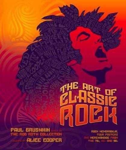
Other coffee books that are offer some album eye candy include The Art of Classic Rock: Rock Memorabilia, Tour Posters and Merchandise from the 70s, 80s and 90s based on the Rob Roth collection. The book has chapters on Bowie, Queen, Led Zeppelin, Pink Floyd and Alice Cooper.
There are so many books out there on Bowie, Paolo Hewitt’s updated “Album by Album” is very attractive and a great accompaniment to listening to his records.
One other book to mention is ‘Sympathy for the Devil: Art and Rock and Roll Since 1967’ by Dominic Molon explores how rock ’n’ roll has inspired generations of visual artists since 1967, a book on the Avant-garde it covers a lot of ground, charting their intersection through works of art, album covers, including the attention to detail from many designers including Peter Saville and his designs. When I think of album art, it’s difficult to think of a better example of a symbiotic relationship between designer and band, than Saville and New Order.
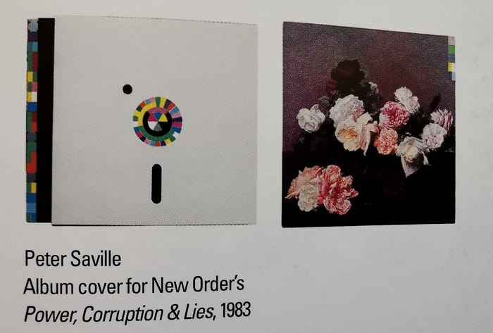
“In the early 1980s, I was interested in the idea of cultural continuum. I wanted to juxtapose the past with the present because I didn’t see why a wealth of cultural history had to be cast behind us. Flowers suggested the means by which power, corruption and lies infiltrate our lives. They’re seductive ” -Peter Saville
Lists of the greatest album covers of all time pop up regularly on the internet, only last week Rolling Stone published their questionable list of their top 100 which frustrates and aggravates many music fans, with the subjective selections and rankings but it also keeps the conversation on the artwork alive.
I’m still optimistic that there is hope for those older and younger music fans who wish to re-engage with the art work. I think the success of the Record Store day has proved that in these current times, whether the album and it’s cover are for the purpose of sharing images on Instagram or simply mounting the art work on the wall which Taylor Swift fans have definitely given a bump to, it is a reminder of the powerful attachment.
“What would musicians be without their sleeves ? Uncovered and undiscovered” -Peter Gabriel
